PORT:
A BARRÔ surgiu de um projeto familiar de pessoas próximas de mim. Isso fez com que eu entendesse muito do projeto antes mesmo de ele ser chamado de projeto...
Quando era apenas uma ideia! E amo isso sobre ele.
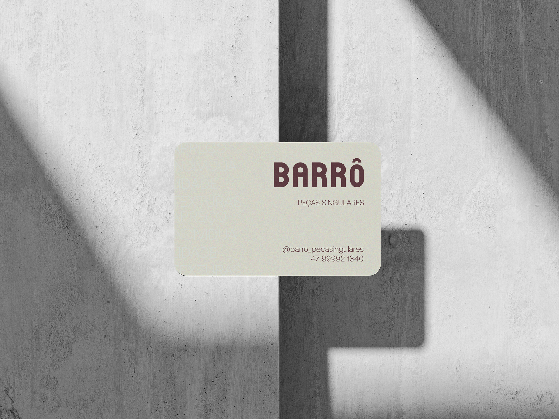
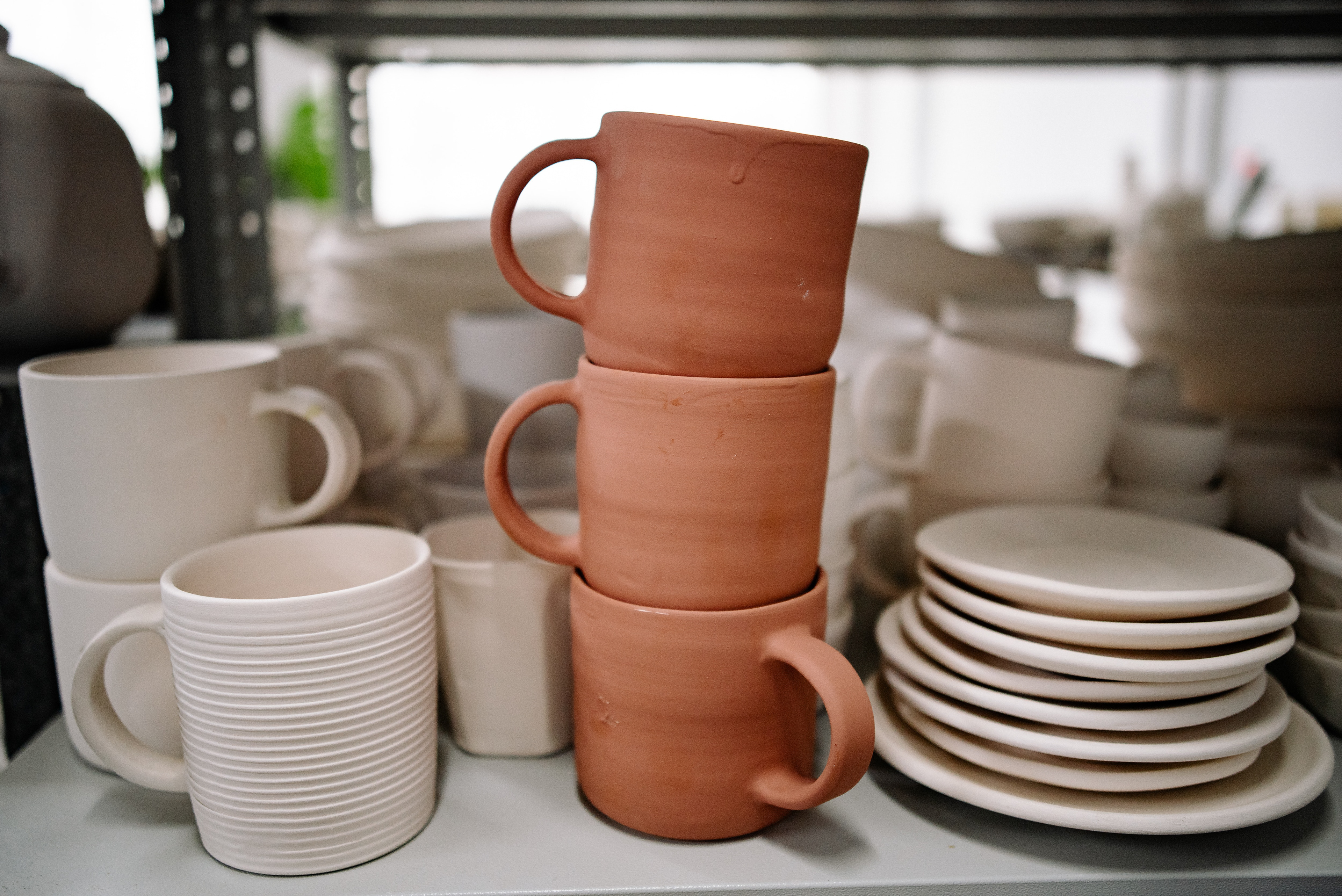
Uma marca autêntica de peças de cerâmica feitas à mão. As cores representam presença e elegância, enquanto a tipografia principal parece até que foi moldada a mão, bem como uma argila. Já a tipografia escolhida para ser secundária é simples e limpa, sem interferir no visual da principal.
EN:
BARRÔ emerged from a family project of people close to me. This meant that I understood a lot about the project even before it was called a project...
When it was just an idea, and i love that about it.
An authentic brand of handmade ceramic pieces.
The colors represent presence and elegance, while the main typography looks as if it has been shaped by hand, just like clay. The secondary typeface is simple and clean, without interfering with the look of the main typeface.
PORT:
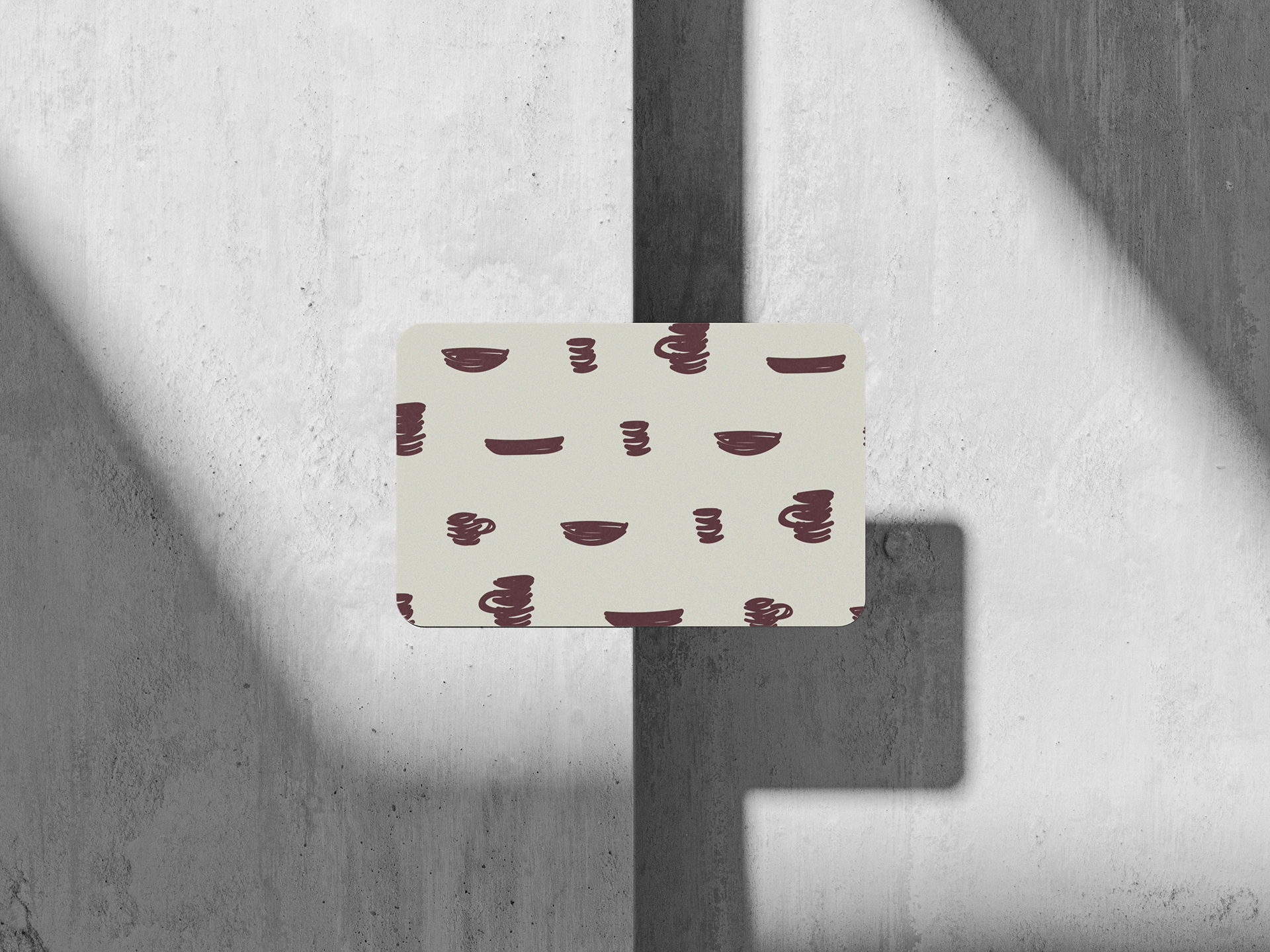
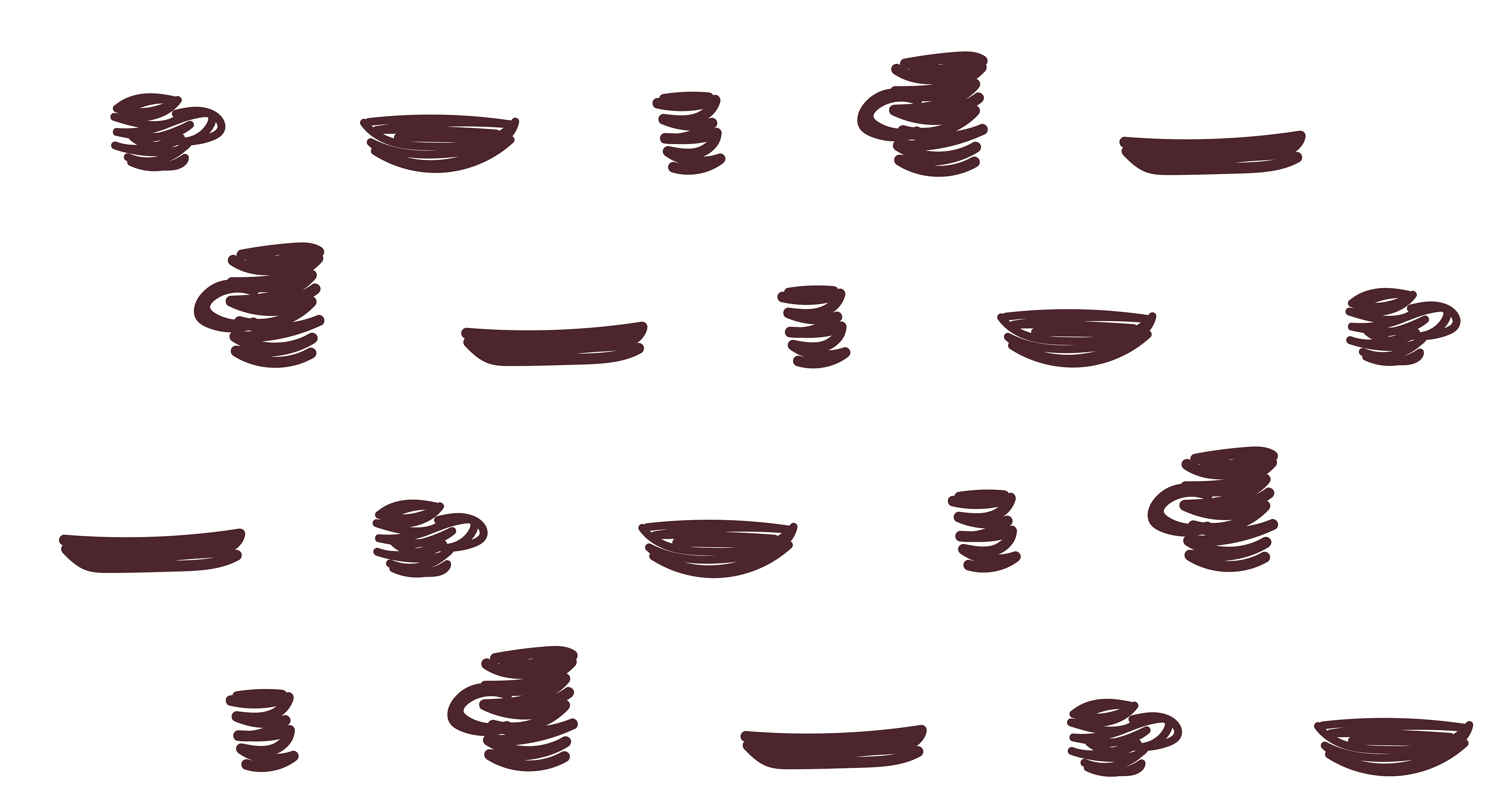
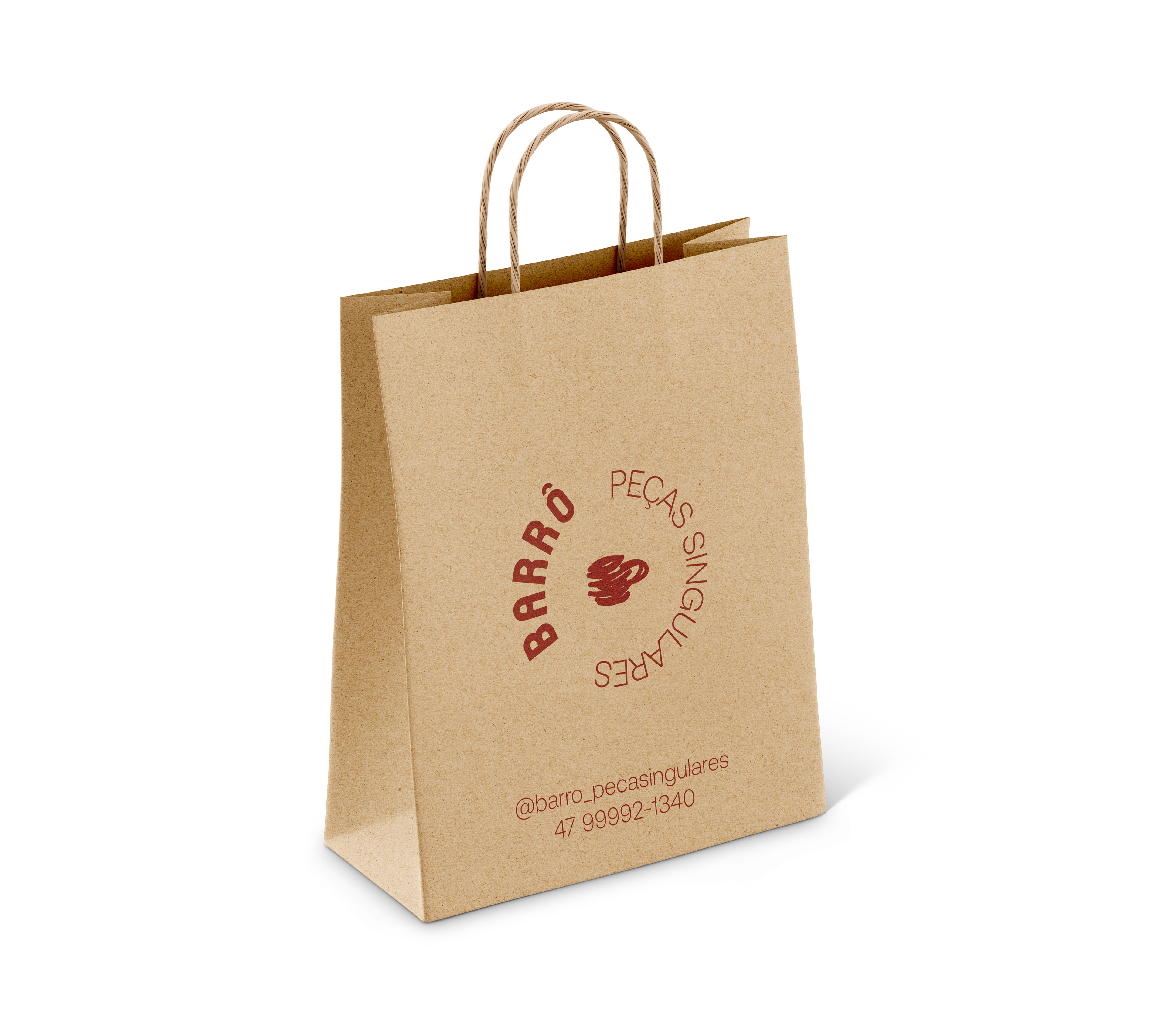
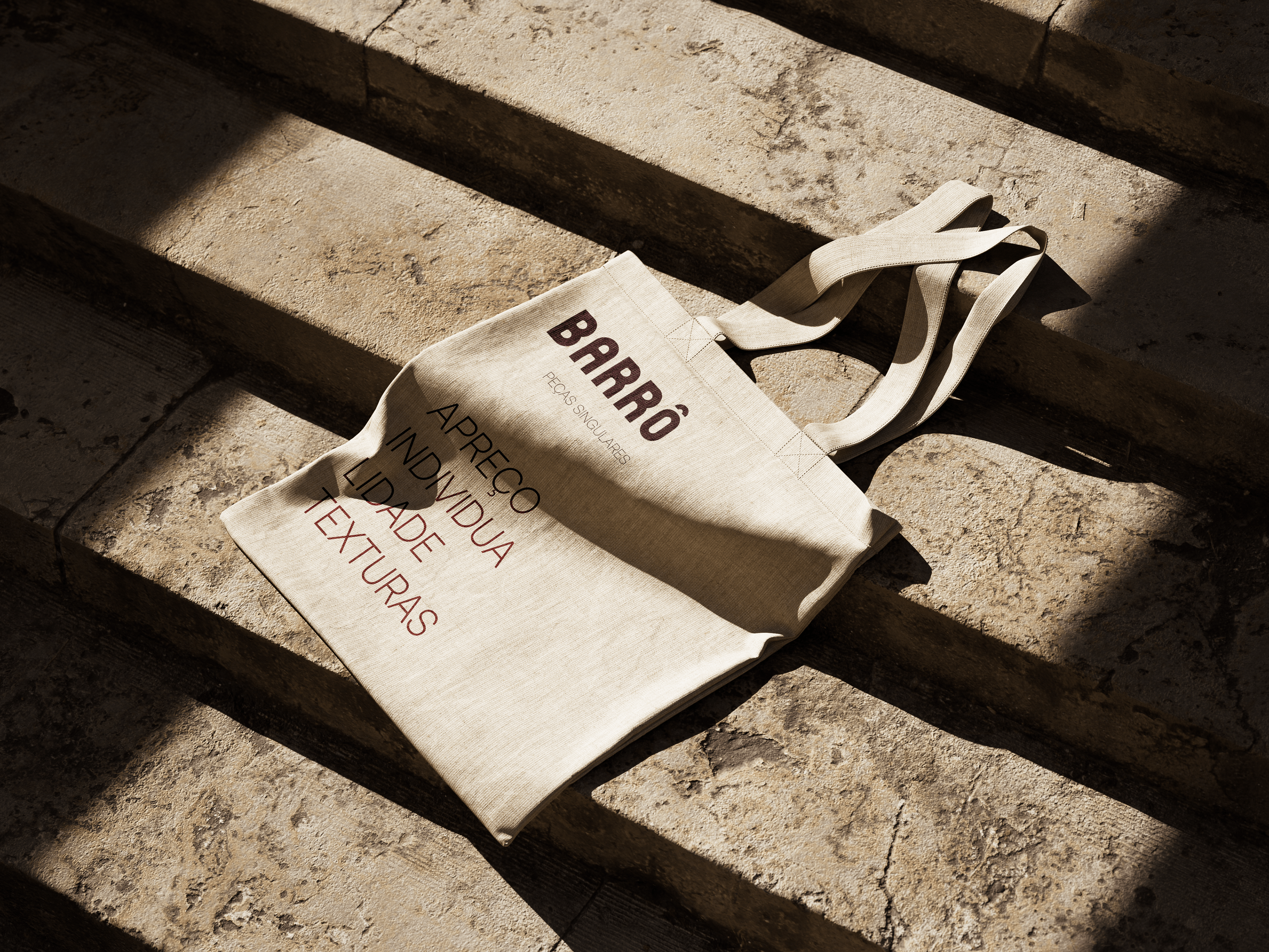
A textura em questão foi ilustrada para ser utilizada em variadas situações: sacola de papel, carimbo, estampa para camisetas, totebags, publicações em mídias sociais.
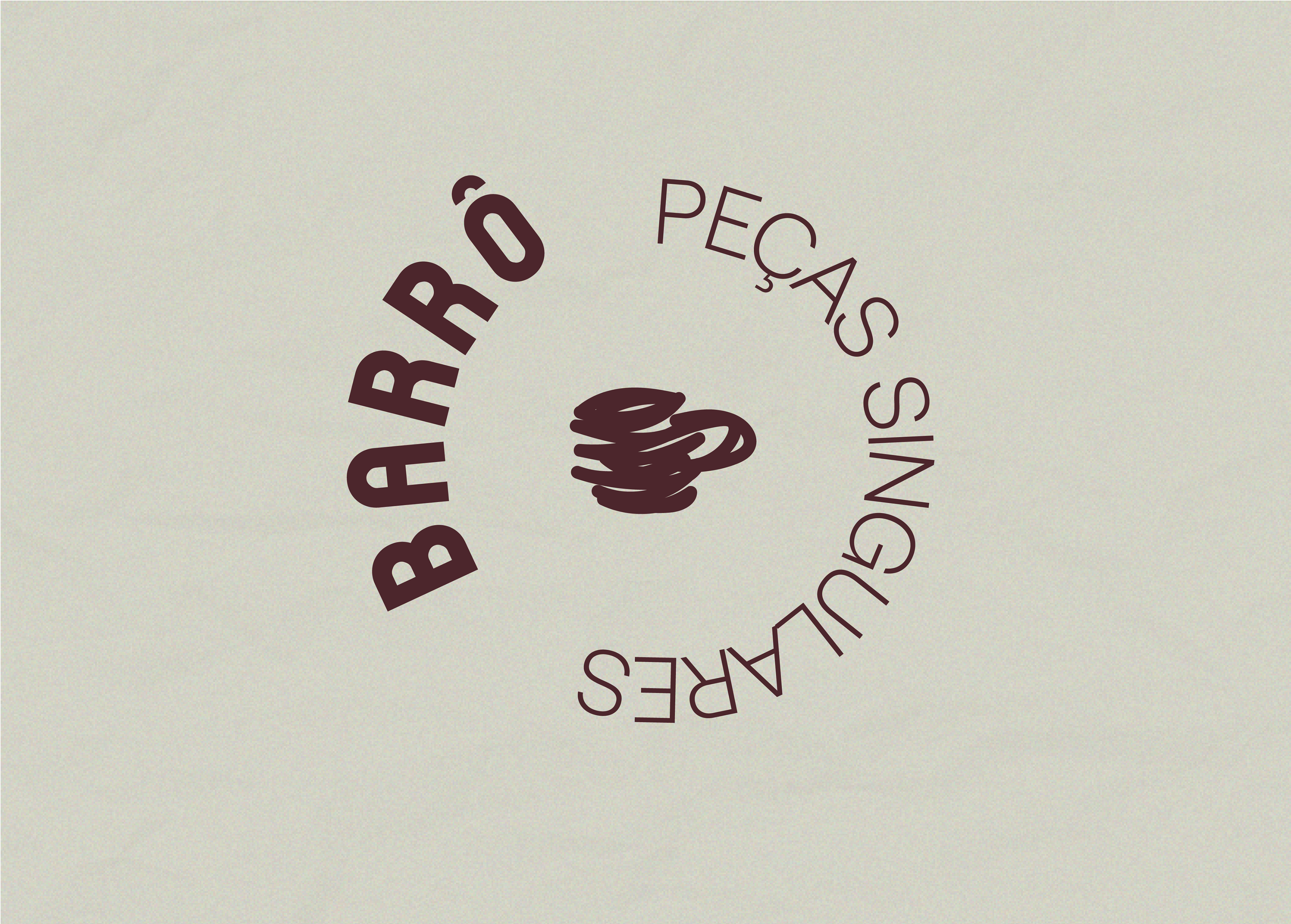
Bem como o Badge com a xícara e o nome da marca em contorno.
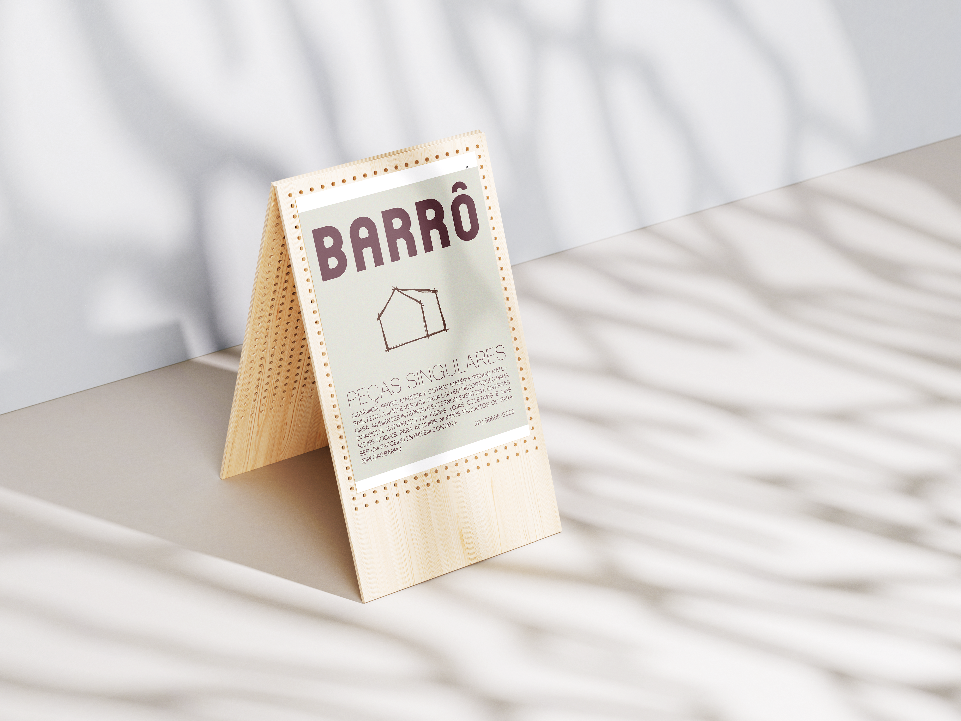
Uma marca autência para representar suas peças singulares.
EN:
The texture in question was illustrated to be used in a variety of situations: paper bag, stamp, T-shirt print, tote bags, social media posts.
As well as the Badge with the cup and the brand name in outline.
An authentic brand to represent your unique pieces.
As well as the Badge with the cup and the brand name in outline.
An authentic brand to represent your unique pieces.